Note: From LibreOffice 4.2.5, the wildchard character sequence is .* (dot asterisk) instead of the plain * (asterisk) – 2014-06-04.
A new patch of Autocorrect feature allows the text replacement before or after arbitrary affixes depending on the starting or ending wildcard character * in the Autocorrect Replace pattern. This is a small, but useful enhancement in word processing, especially for affix rich languages, but I will show a nice improvement for French typography, too, using this feature.
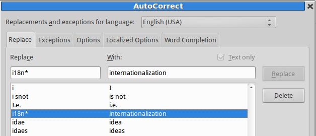
For example, with the „i18n*” → „internationalization” item Autocorrect will find and replace i18ns with internationalizations, too. Hungarian spelling dictionary handles two thousand suffixes of a given noun, dozens of them are quite frequent, simply exceeding the limitations of the old Autocorrect feature. With the new patch and the modified Autocorrect list LibreOffice will be able to handle all forms of serious misspellings and common abbreviations, that is a real innovation for Hungarian and similar languages. But the following examples help the word processing in English and other languages, too:
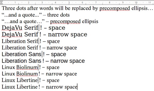
- Typographic correction of ellipses (with the precomposed ellipsis character U+2026): *… → …, eg. word… → word… (see below on the screenshot)
- The same combined with quotation marks: “…* → “… and *…” → …”, eg. “…and a quote…” → “…and a quote…”
- Simplified input for special symbols: *%o → ‰, eg. 7%o → 7‰
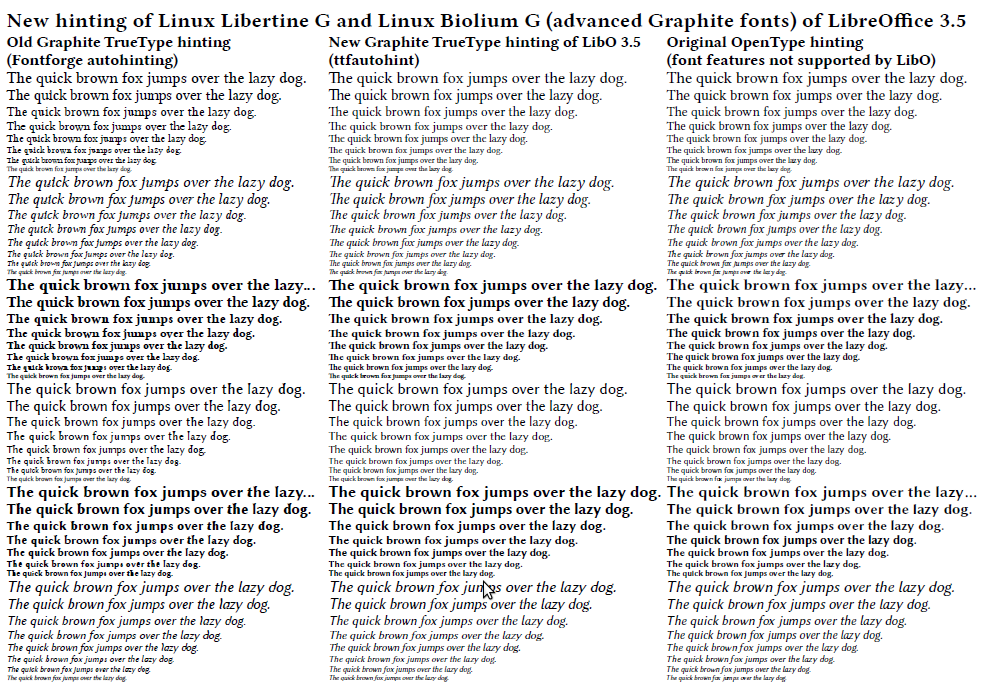
- French punctuation. LibreOffice has got only a poor man’s input method for French typography, inserting full long („typewriter”) spaces before question and exclamation marks, colon and semicolon, and before and after guillemets (only Graphite fonts Linux Libertine G and Biolinum G support French typography well). With the new Autocorrect patch and with the following replacements, it’s possible to get better spaces in the case of Unicode fonts with narrow no-break space (U+202F): *! → ! (U+202F !), * ! → ! (a replacement for the same sequence to avoid multiple insertion of narrow no-break space) etc. It seems, this could be a general method, because missing narrow no-break spaces are replaced by normal spaces (like in the recent poor man’s method). But fonts with narrow no-break spaces, like DejaVu Serif, Liberation Sans and Serif, Linux Libertine and Biolinum (also not Graphite versions) give better French typography (to use the new method, switch the French poor man’s method off in the Localized options of Autocorrect settings):