 LibreOffice 3.5 has got extraordinary typographical capabilities with the improved Graphite port of the new versions of Linux Libertine and Linux Biolinum font families: new and improved font variants from Philipp Poll et al., like the excellent Linux Libertine Display G (true size variant of Linux Libertine for 16pt or more) and the new bold and semibold variants (see also LinuxLibertine.org); font features, like true small caps, old figures, ligatures, proportional numbers have been extended with proper combining diacritics for scientific texts and several languages, and with extended superiors (also true size variant) for typesetting of captions, footnotes, etc., see release notes/examples of the Graphite fonts.
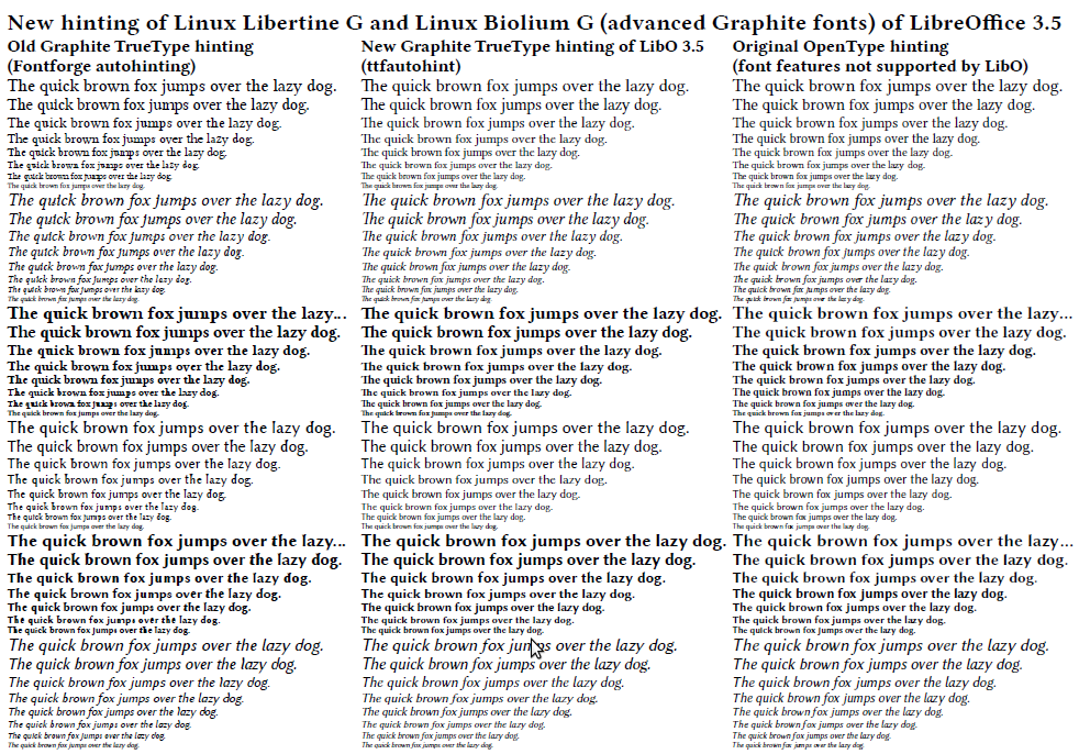
The main problem of the old versions of the Graphite TrueType fonts was the ugly hinting (the PostScript Type 2 hinting of the original OpenType fonts has been lost by transformation, and replaced by Fontforge autohinting). Fortunately (also thanks to the ttfautohint related article of Libre Graphics World editor Alexandre Prokoudine), I was be able to fix the hinting by the new FreeType tool ttfautohint, so Linux Libertine G and Biolinum G Graphite fonts of LibreOffice 3.5 are suitable for digital publishing, too. Moreover, ttfautohint gives better result in a few places, than the original OpenType hinting, see the bad space in the Linux Libertine Italic text “laz y”, or the bad “w” in the Biolinum Bold and Italic OpenType text. (Click on the picture to see the three different hintings in Adobe Reader on Linux).
Tartalomhoz
Thanks a lot for the great Updates to LibreOffice support for Graphite. This is outstanding and gives really great results.
However, I would like to ask whether there are other fonts than Biolinum and Libertine out there. I like Libertine very much, but Biolinum does not match my taste. Are there any other Fonts available?
I am looking for somethin more Arial-like such as Sophia Nubian (http://scripts.sil.org/cms/scripts/page.php?site_id=nrsi&id=SophiaNubian). However, this font has not been updated for quite some while and it has some wide spacing compared to other fonts. Do you have any suggestions?
Thanks!
Thanks for your feedback. DejaVU fonts of LibreOffice are not Graphite fonts, but they have some really nice features: excellent Unicode coverage, good kerning and hinting, several variants (nice bold, condensed, light [near 50% ink savage!]). But I suggest to check Biolinum on min. 600 dpi resolution, too.
Dear Nemeth, thanks a lot for your reply. I will try it out.
Are the regressions on Graphite engine introduced on LibO 3.4 fixed on LibO 3.5?
Several features that work perfectly on LibO 3.3, OOo 3.3 and AOO deb builds do not work (italic correction) or are unreliable (number to name substitution) on LibO 3.4.x.
BTW, Linux Libertine G and Linux Biolinum G are my default font on all my documents! 😉
Unfortunately, they are not. I suggest to use LibreOffice 3.3 for these features. There is a promise from Graphite development to fix the boundary related problems, like Italic correction, so I hope, it will be fixed in the near future. I’m glad of your comments, thanks for them.